


This collection traces the development of disease mapping from early sanitary reform and medical geography to modern epidemiological surveillance. Robert Baker’s Sanitary Map of the Town of Leeds (1842), prepared for Edwin Chadwick’s landmark inquiry into the sanitary condition of the labouring population, is an important early example: by relating disease and mortality to overcrowding, drainage and environmental conditions, it helped establish cartography as evidence for public-health reform.
John Snow’s maps of the 1854 London cholera outbreak are among the foundational works of epidemiology. His Broad Street map revealed the spatial concentration of cholera deaths around the contaminated pump, while his South London water-company map compared mortality among populations supplied by different water sources. Together they helped make the case for water-borne transmission and demonstrated the power of spatial analysis in investigating epidemics. Henry Acland’s 1856 Oxford cholera map similarly plotted cases and choleraic diarrhoea against drainage and local conditions, extending detailed urban disease mapping beyond London.
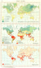
Alexander Keith Johnston’s mid-19th-century map of the geographical distribution of health and disease, including yellow-fever regions, belongs to the emerging field of medical geography, which sought relationships between illness, climate and environment. Later maps by Élisée Reclus showing malaria in Italy, fever in the Caucasus, plague in Kurdistan and Russia, and prevailing diseases in Mexico illustrate how such geographical thinking entered widely circulated reference works.
Alfred Haviland’s 1875 choropleth maps of cancer, heart disease and phthisis [tuberculosis] mortality across England and Wales were pioneering national statistical maps. Their graduated shading exposed regional patterns in chronic disease and made geography itself an object of medical investigation. Stanford’s 1887 statistical disease maps of the British Isles and later maps of typhoid and zymotic mortality show this technique becoming established in statistical cartography.
The collection’s remarkable Bombay material records a further transformation. Regional maps of plague and cholera mortality during 1897 document the scale of epidemic disease across the Bombay Presidency, while the Indian Plague Advisory Committee’s 1911 maps plot human plague cases, infected rats, guinea-pig deaths and individual houses month by month during the Third Plague Pandemic. These exceptionally detailed investigations helped clarify the rat–flea transmission cycle of bubonic plague and show epidemiological cartography operating at household level.
Later malaria maps, including Tanganyika and global distributions, demonstrate the continuing role of mapping in twentieth-century public-health planning and disease control. Taken together, the maps show the evolution from environmental observation and sanitary reform to statistical comparison, spatial epidemiology and systematic disease surveillance.